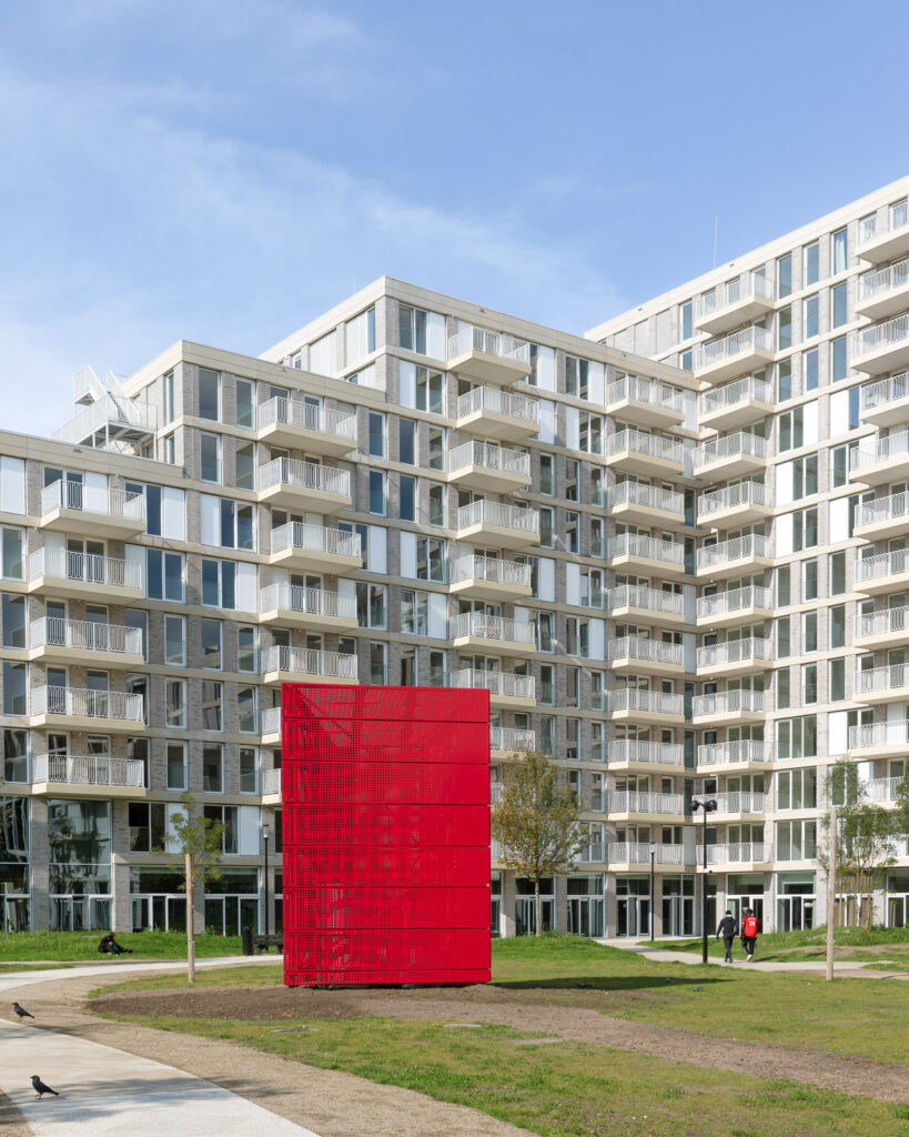
This massive scale colourful affordable housing project around a compelling green park was the breakthrough in the conversion of a predominant office area into a mixed-use district.
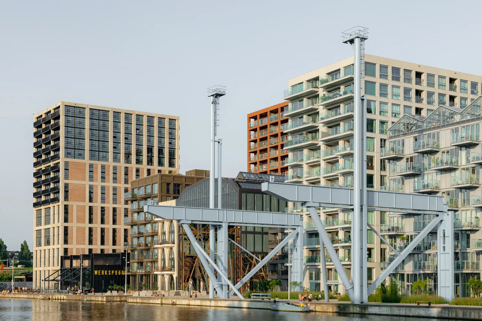
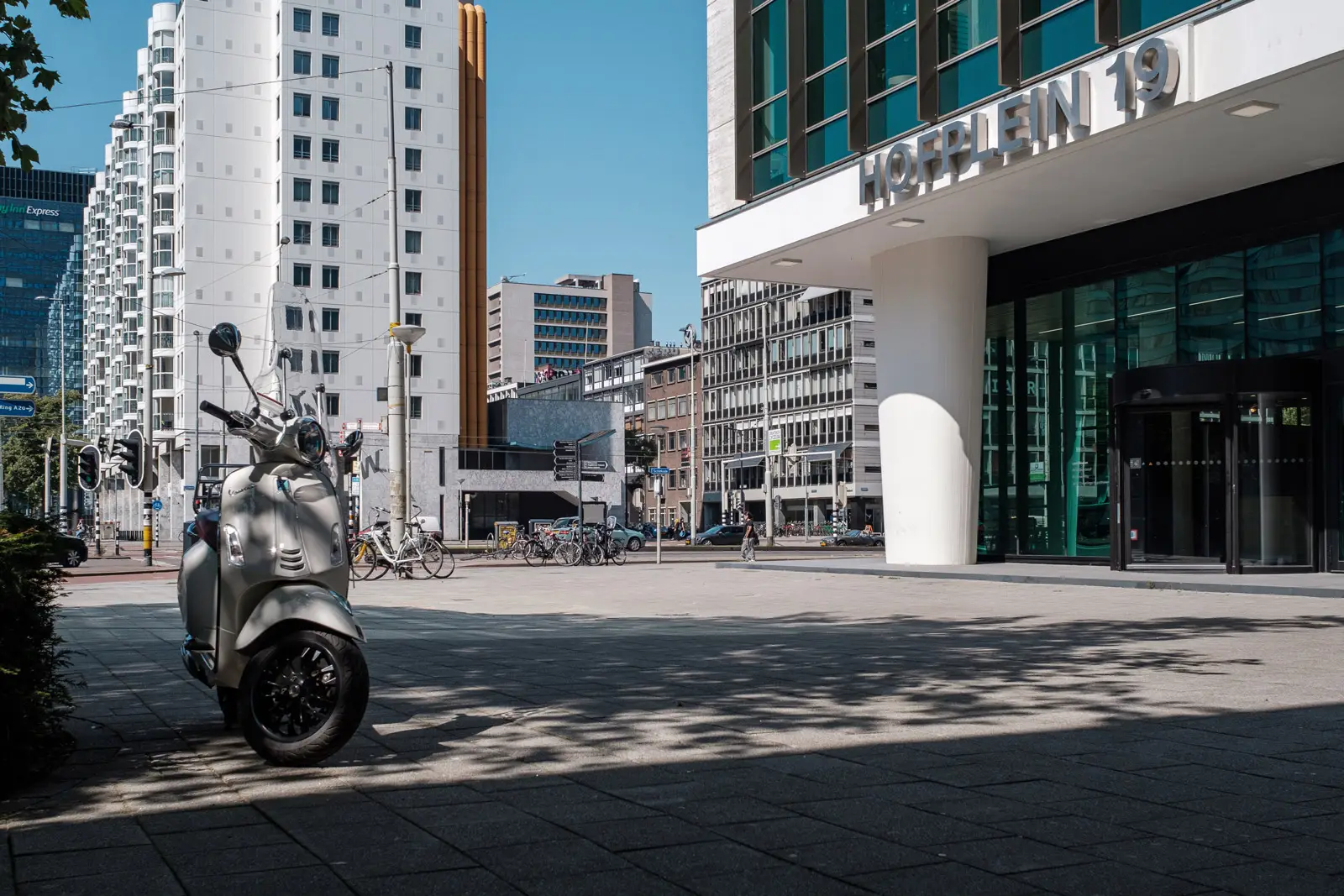
Amsterdam Southeast is a suburb made from the sixties up till the nineties. As it came of age it showed the social fatigue these areas usually have. As the buildings came of age, low-income groups moved in, and a lot of office buildings became vacant. As the Bijmermeer, as this suburb is called was transformed from a brutalist post war modern housing district into a contemporary mixed use thriving neighbourhood, the urge for amelioration of the office district came to full swing. Offices could make way for homes, but the area’s poor social safety has put investors off for a long time. With our design for Our Domain, we created a breakthrough this impasse.
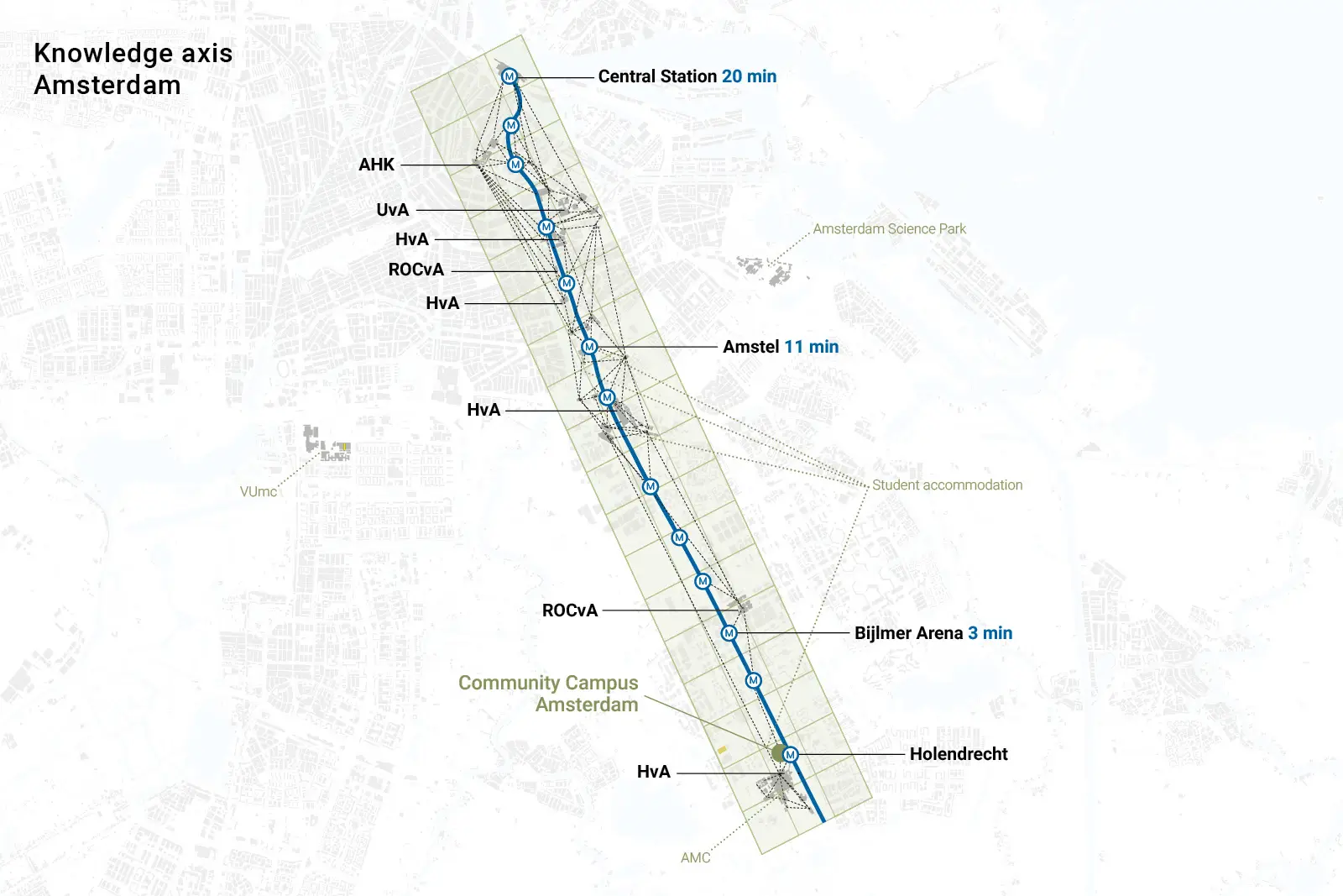
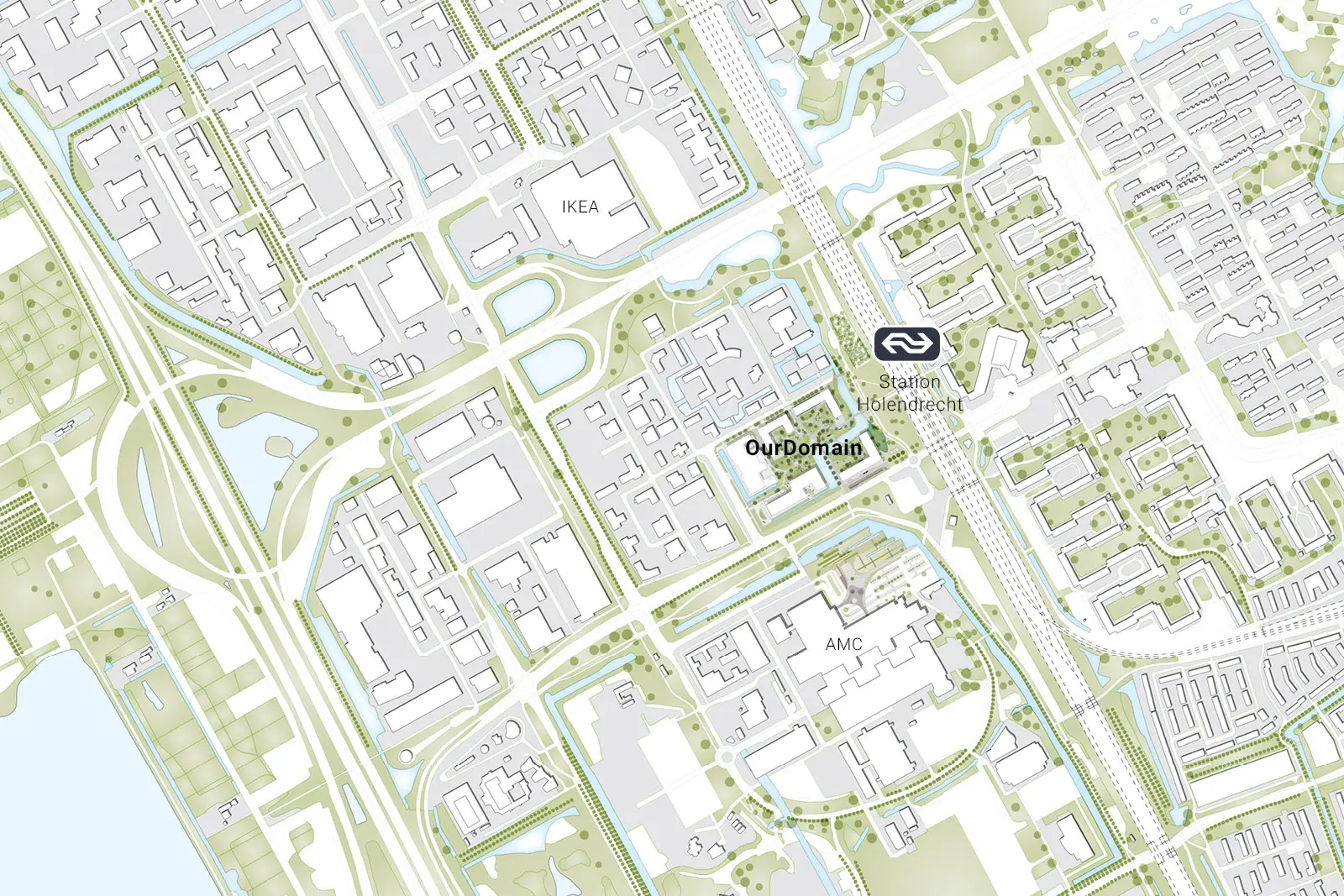
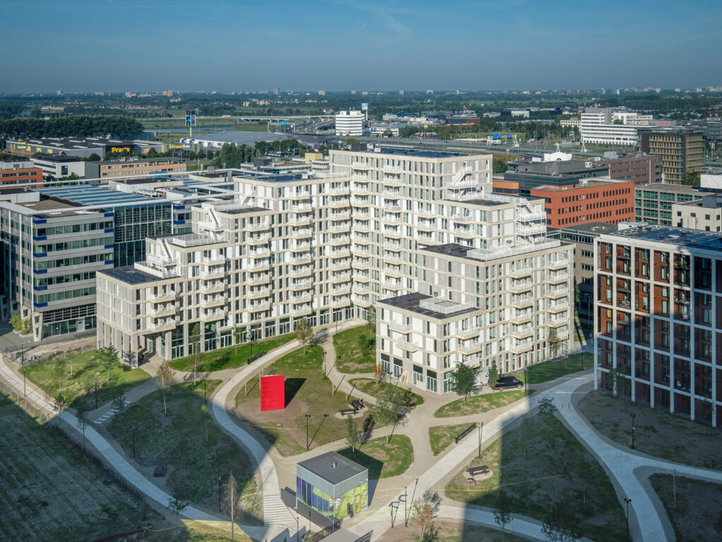
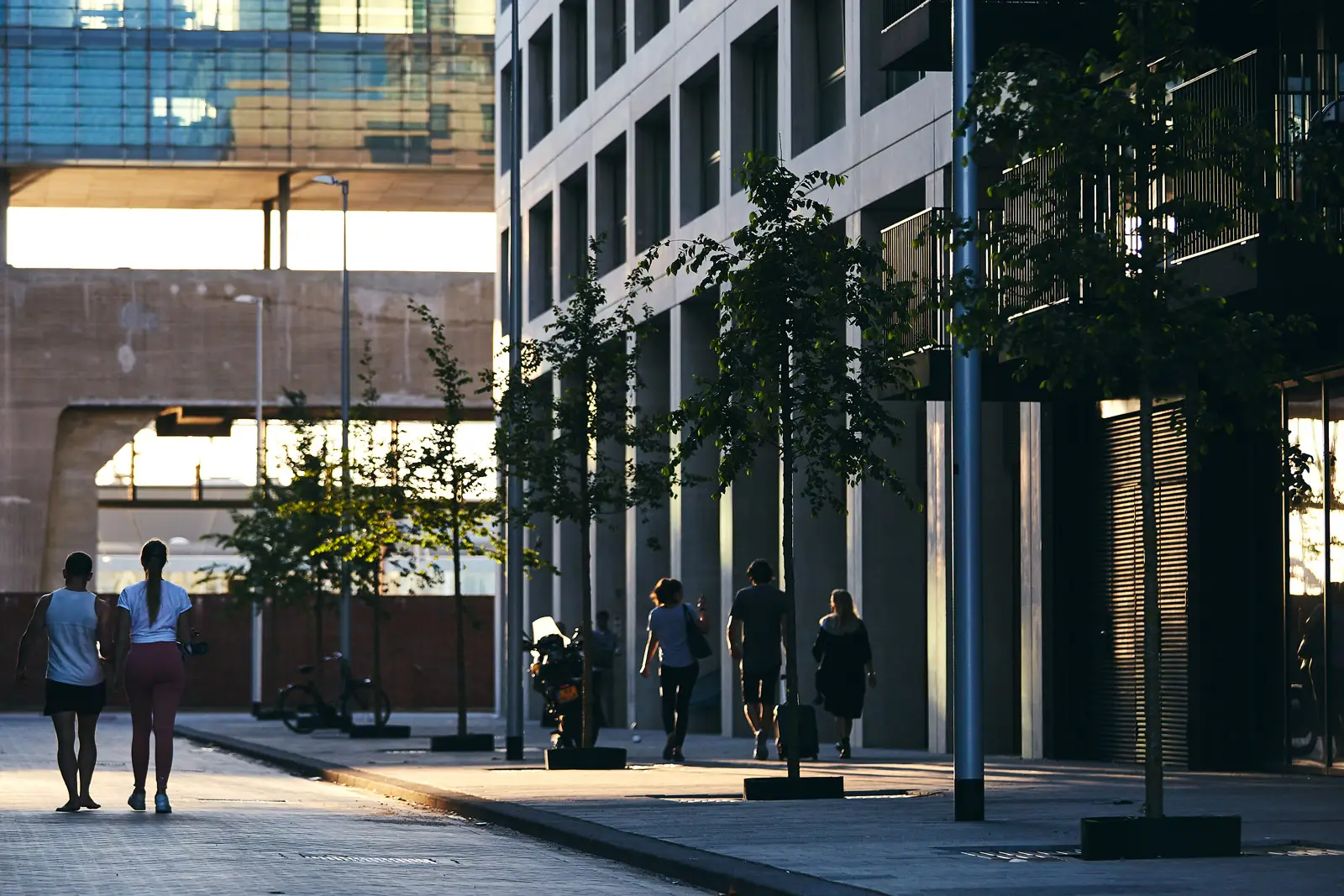
It is located on a knowledge axis, consisting of educational institutions and student housing in Amsterdam. Strategically located next to an academic hospital and train station, the campus with its critical mass of approximate 1.500 apartments and amenities introduces a first residential centre in a predominantly office area. This new campus is the catalyst that ignites a long-desired change. The urbanistic objective of the campus is to introduce fundamental change that generates new connections and facilitate social space that inspires.
The choice for a campus community at this location is paramount. For a first time it realistically provides the right quality and scale to attracted people to live in this predominant office area. The idea for a campus ties in with a current Amsterdam housing issue of great shortage of housing for students and young people.
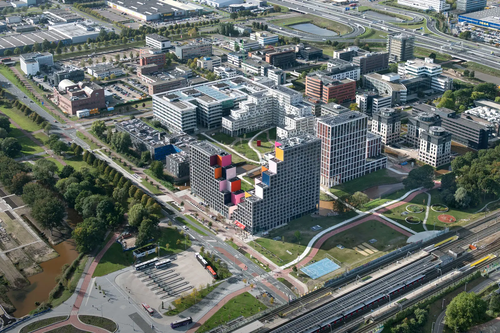
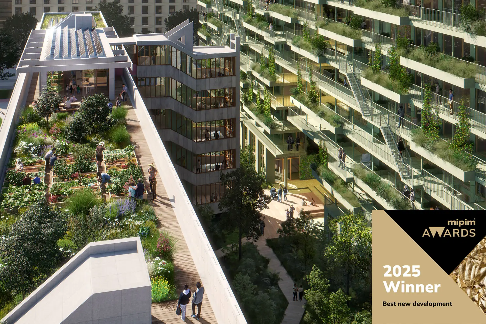
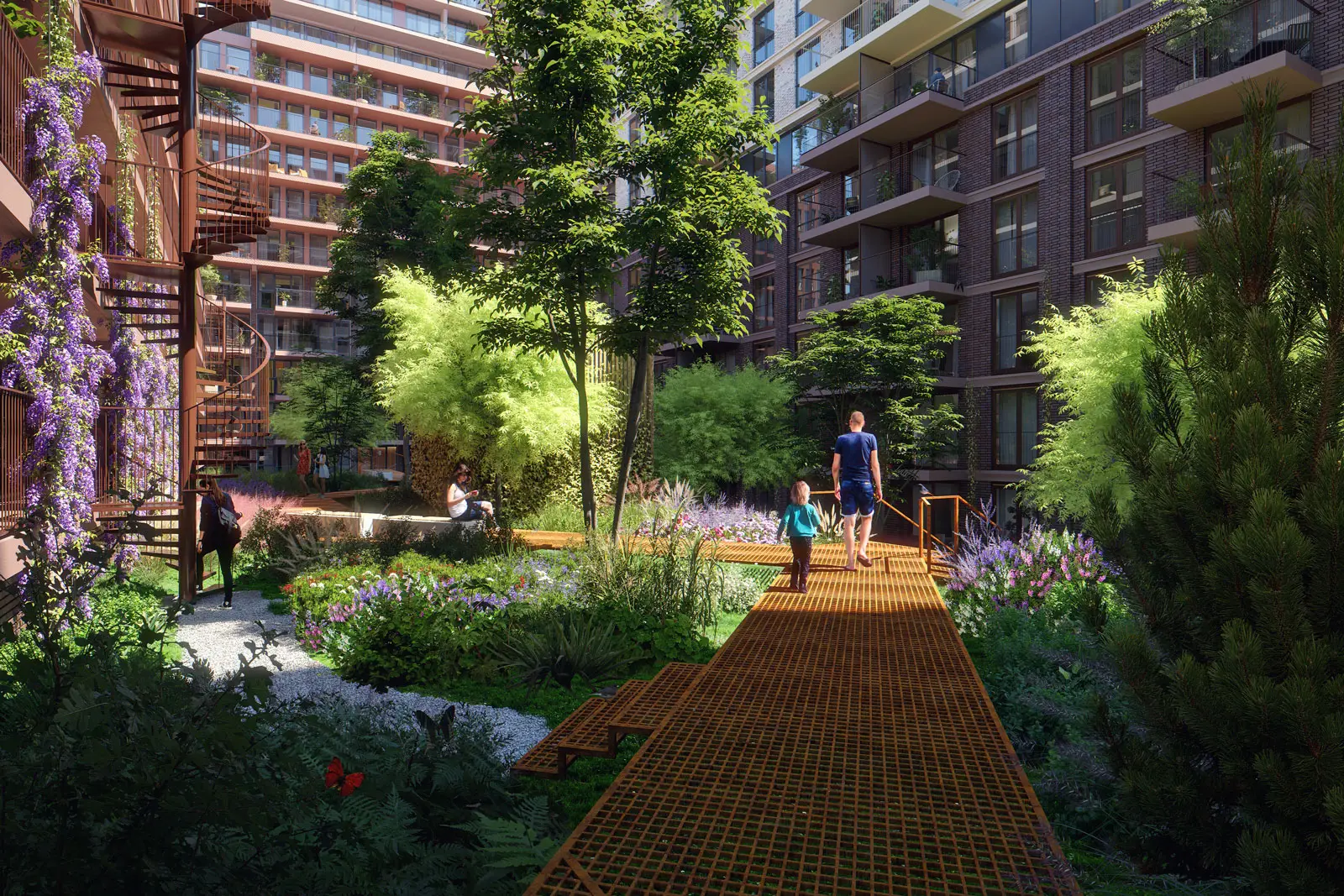
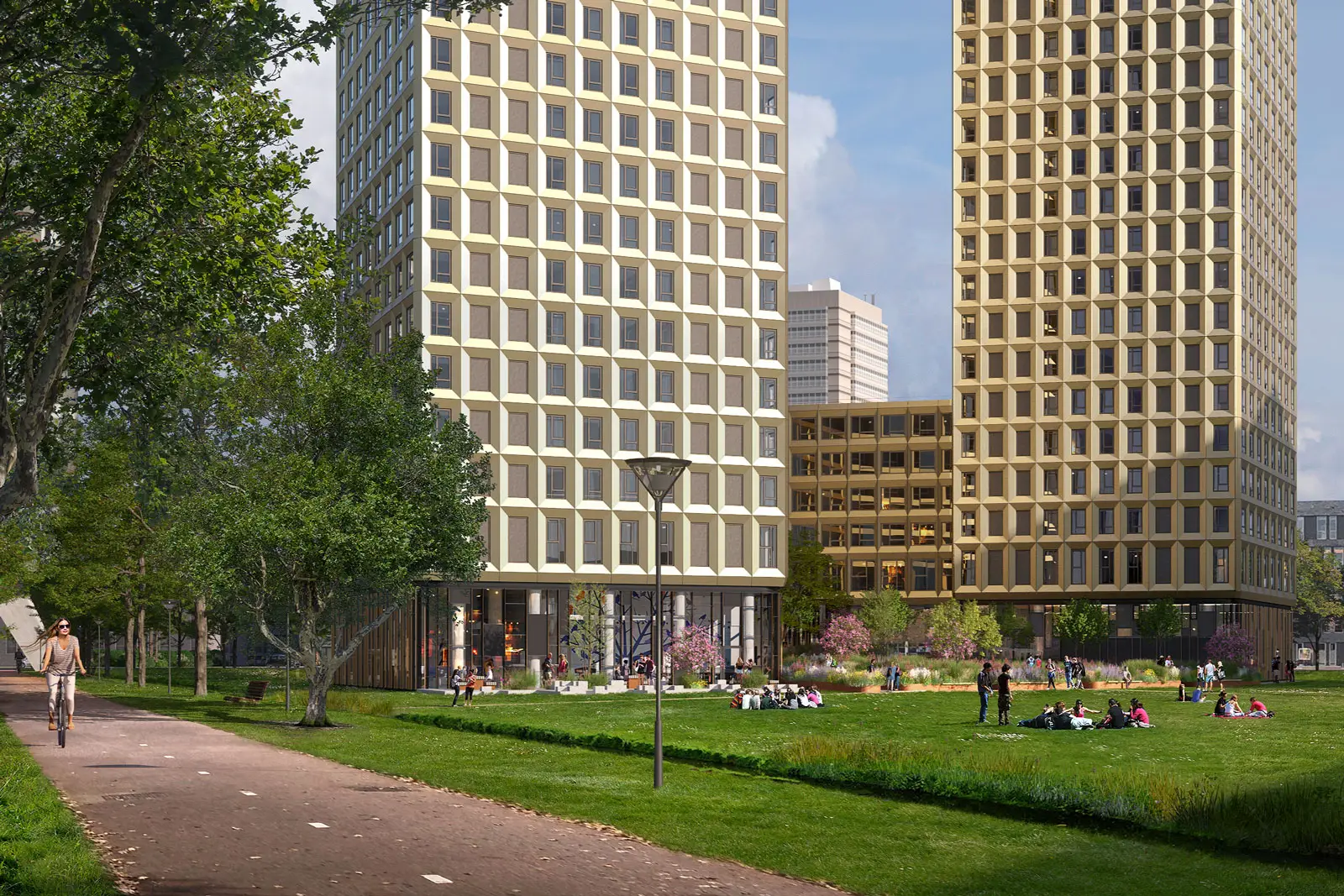
Large housing volumes in cities are often viewed with suspicion because many did not exactly provide social cohesion. Yet the concept of mass does not necessarily have to inspire fear. Mass is essential for a living and diverse city. Without mass there is no urban quality, without mass there is no animated plinth, no eyes in safe streets, no profitable public transport hubs and no mix of resident groups. With three stepped towers we intensified the volume and added a park. The scale of the project brings affordability within reach, and the shared green outdoor space is a momentum in social experience, community building and increased safety, making the project a catalyst for much more than just itself. As we started with a small independent idea, it has grown into the largest transformation area in Amsterdam not planned by the municipality. It has been named one of the most important transformative buildings by the American news channel CNN.
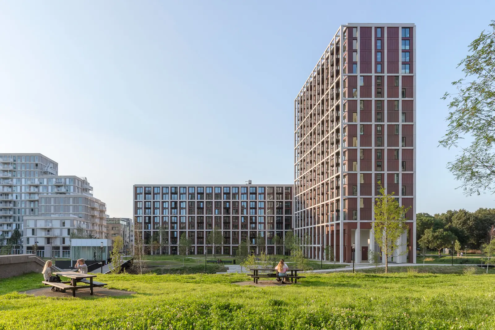
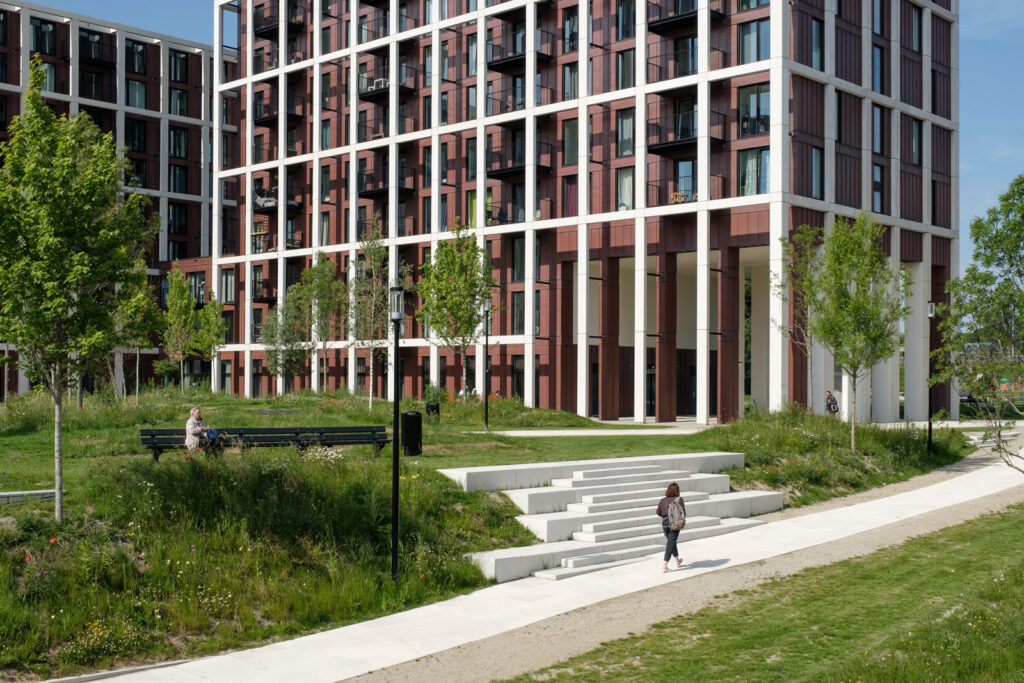
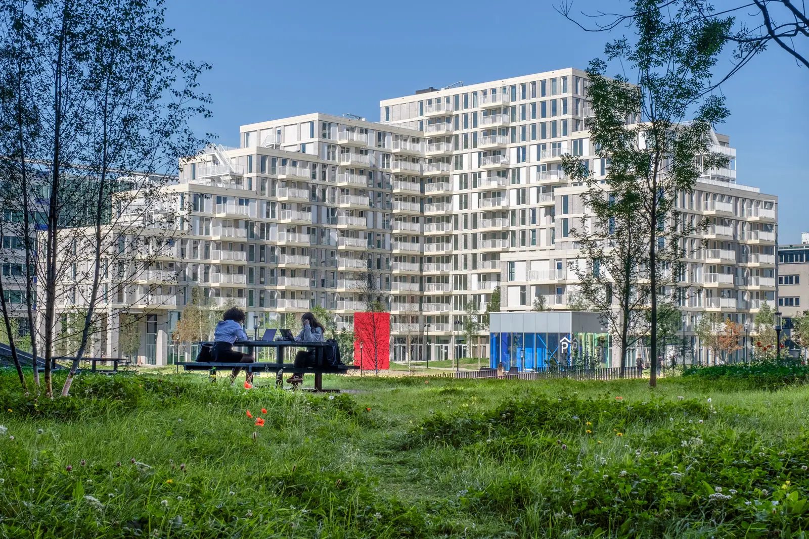
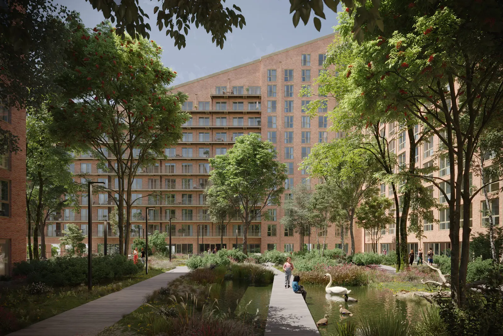
Inserting three large housing blocks (East House, North House and West House) around a park allows for a recognizable residential atmosphere in a predominant office location. The three residential blocks are cornerstones that mark the park boundary. Together with two existing buildings the campus will become the pivotal centre of the area. The lush, inviting landscape design adds articulated topography to the park for which the residual soil of excavating the underground parking garage was used.
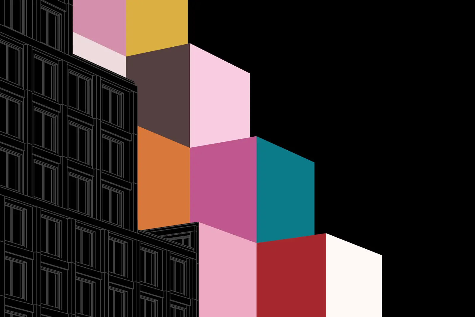
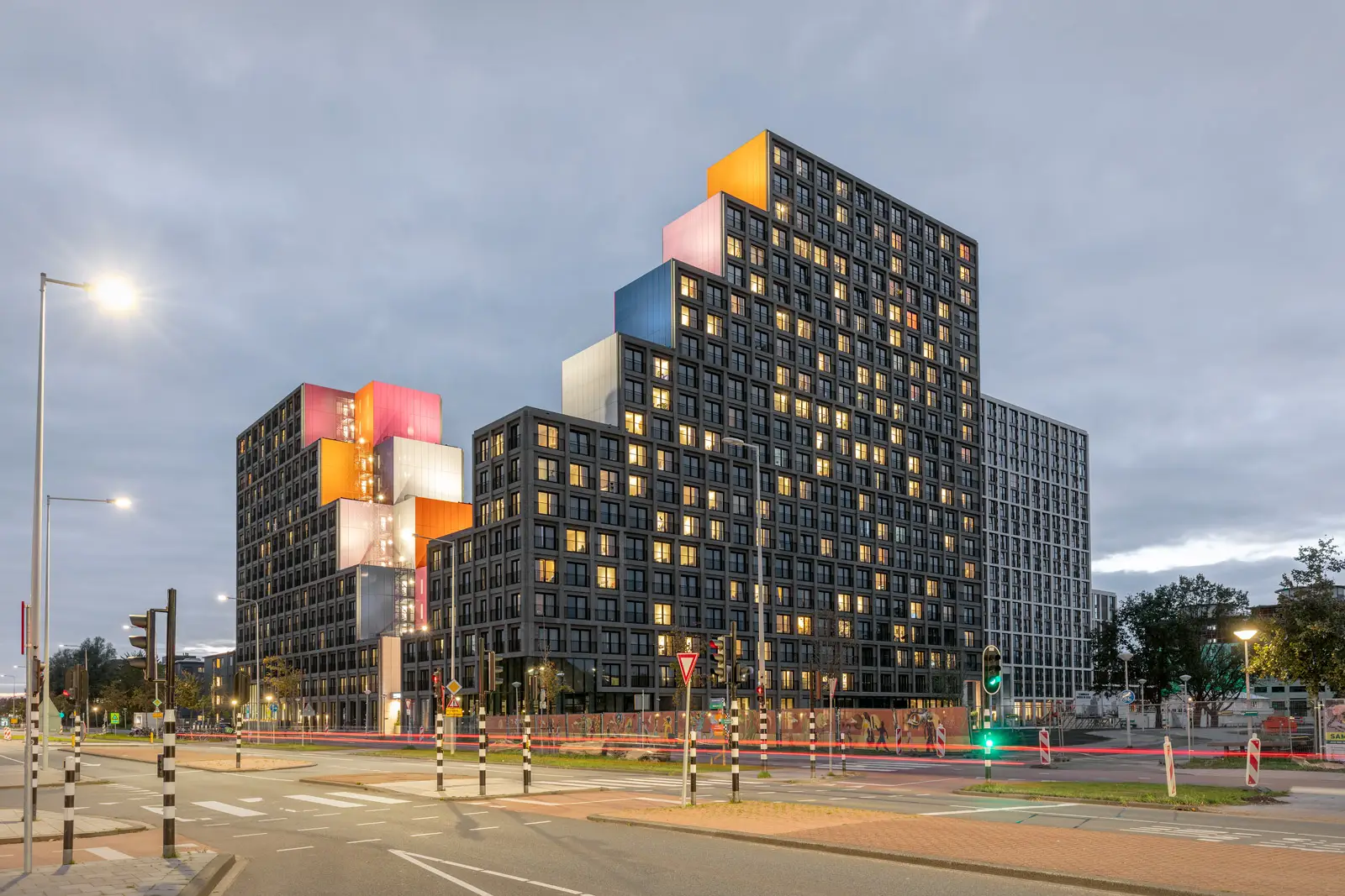
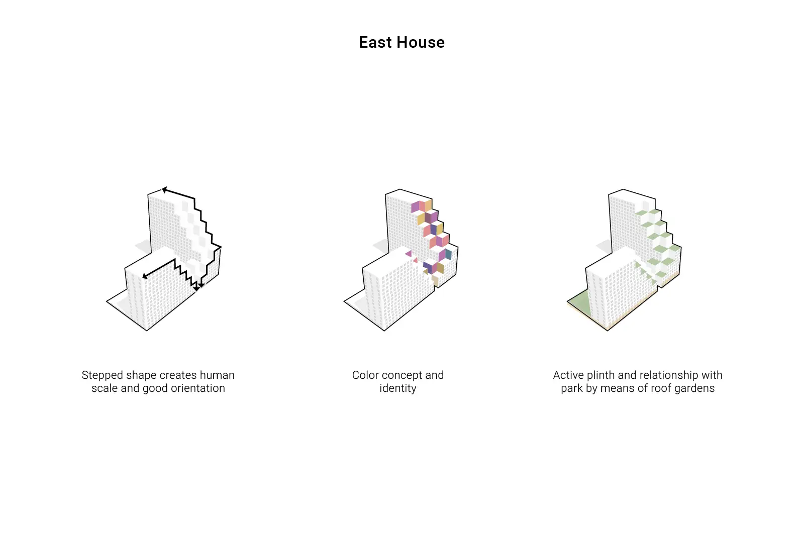
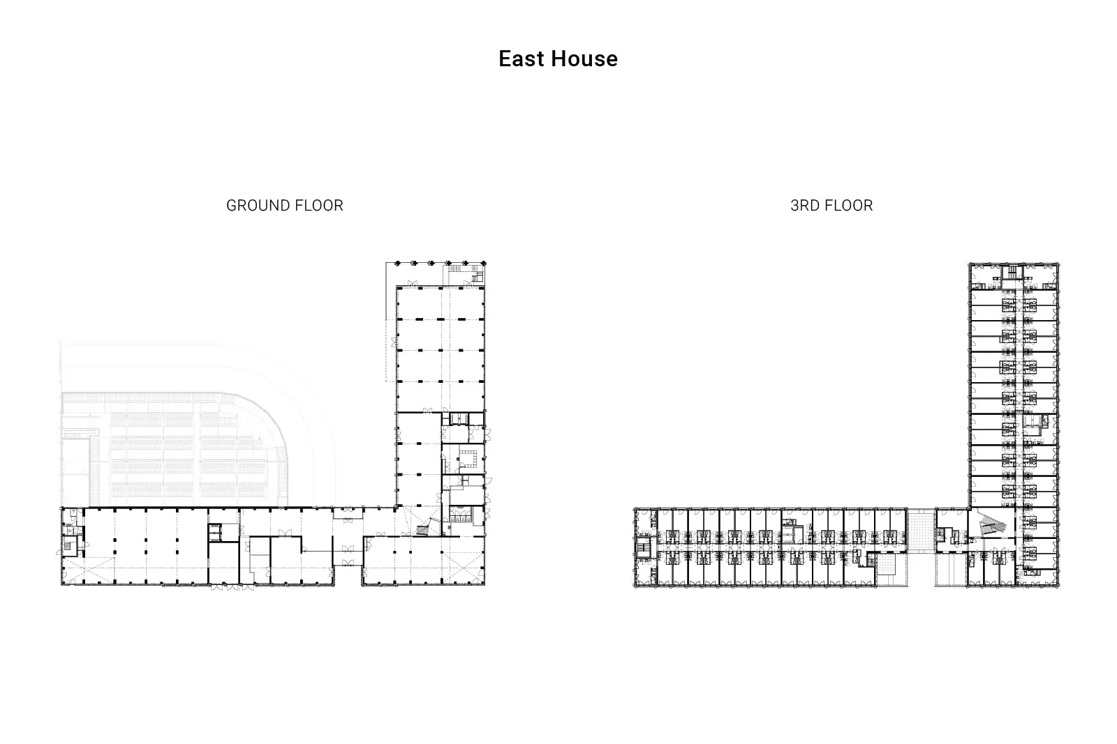
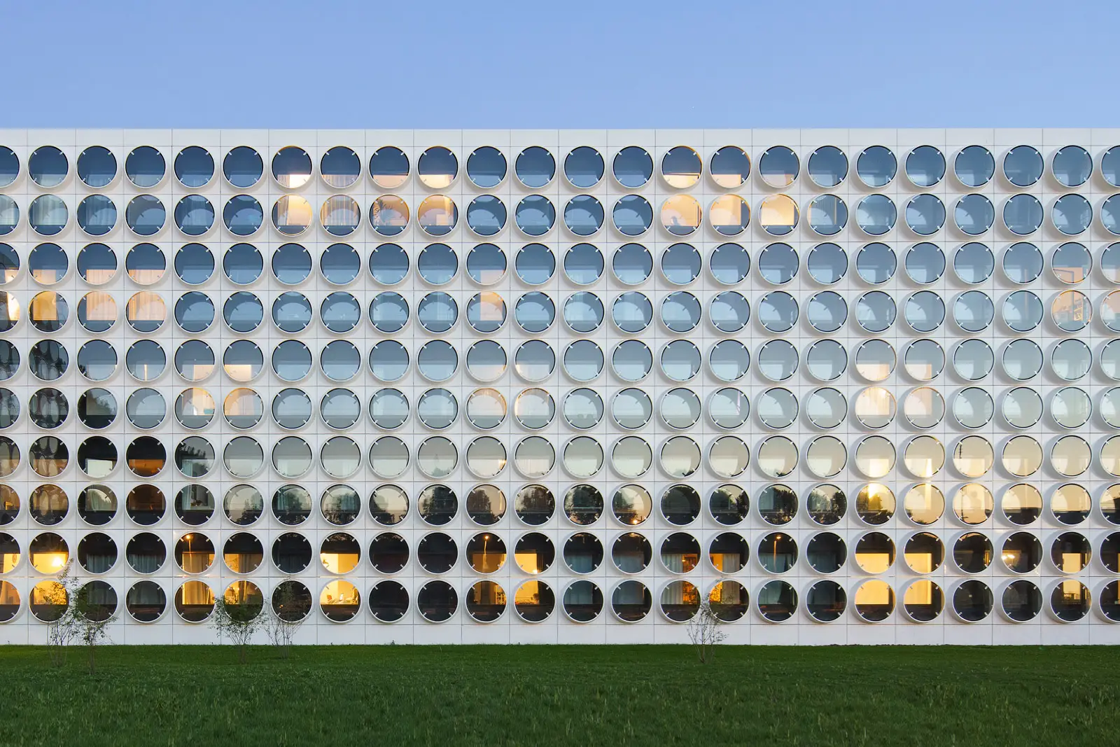
With a surface of 40.000 square metre and almost 1.000 student apartments, East House is large. Our premise is to give this big building a clear housing expression to avoid an abstract mass like the offices in the vicinity. The buildings’ program, with many small apartments without balconies, has little architectural elements available to give it character. Its cascading facade on two sides, therefore, immediately gives the building its own architectural expression and anchors it in its surrounding.
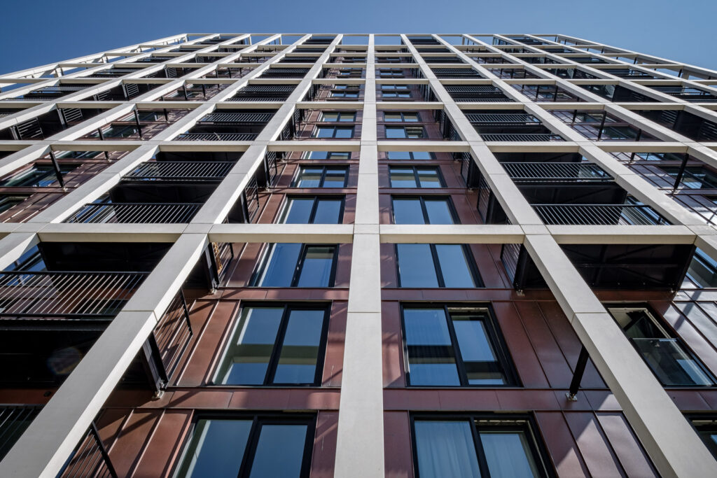
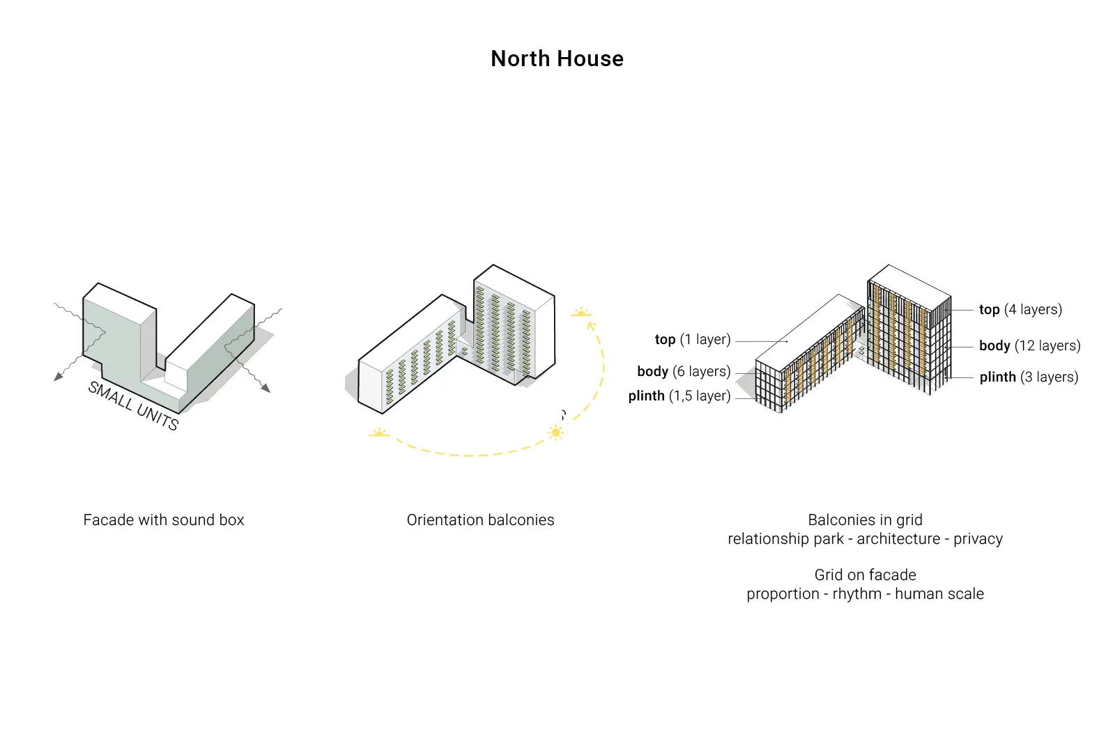
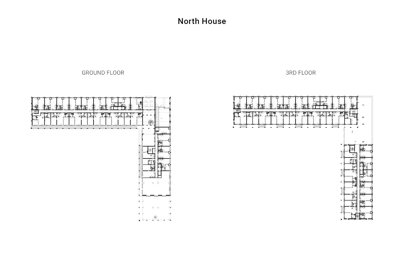
We designed North House as a cornerstone with a low wing and a high tower that marks the park entry to the metro station. It has an eloquent build up with a central corridor with the smaller apartments on the North-East façade and the larger apartments with balconies at the South-West façade. On its shackled volumetric design, it also has a recognizable enveloping grid pattern. This pattern introduces a human scale and is an independent statement of rhythm and measure designed as a concrete grid that envelops a copper clad building. This materialization unites the atmosphere of living and working.
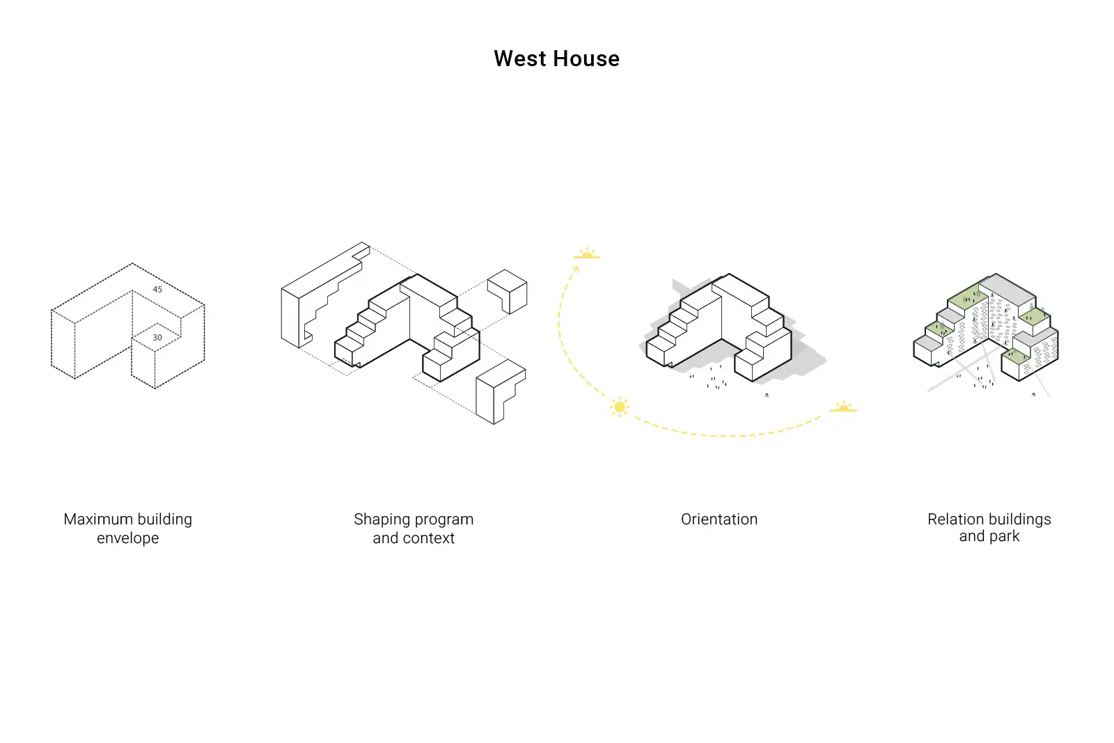
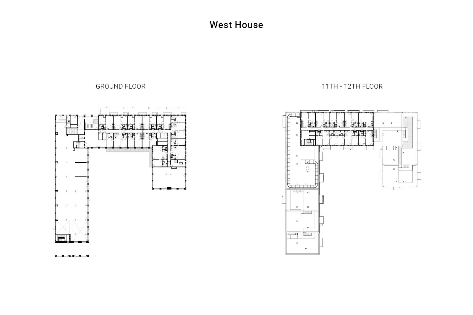
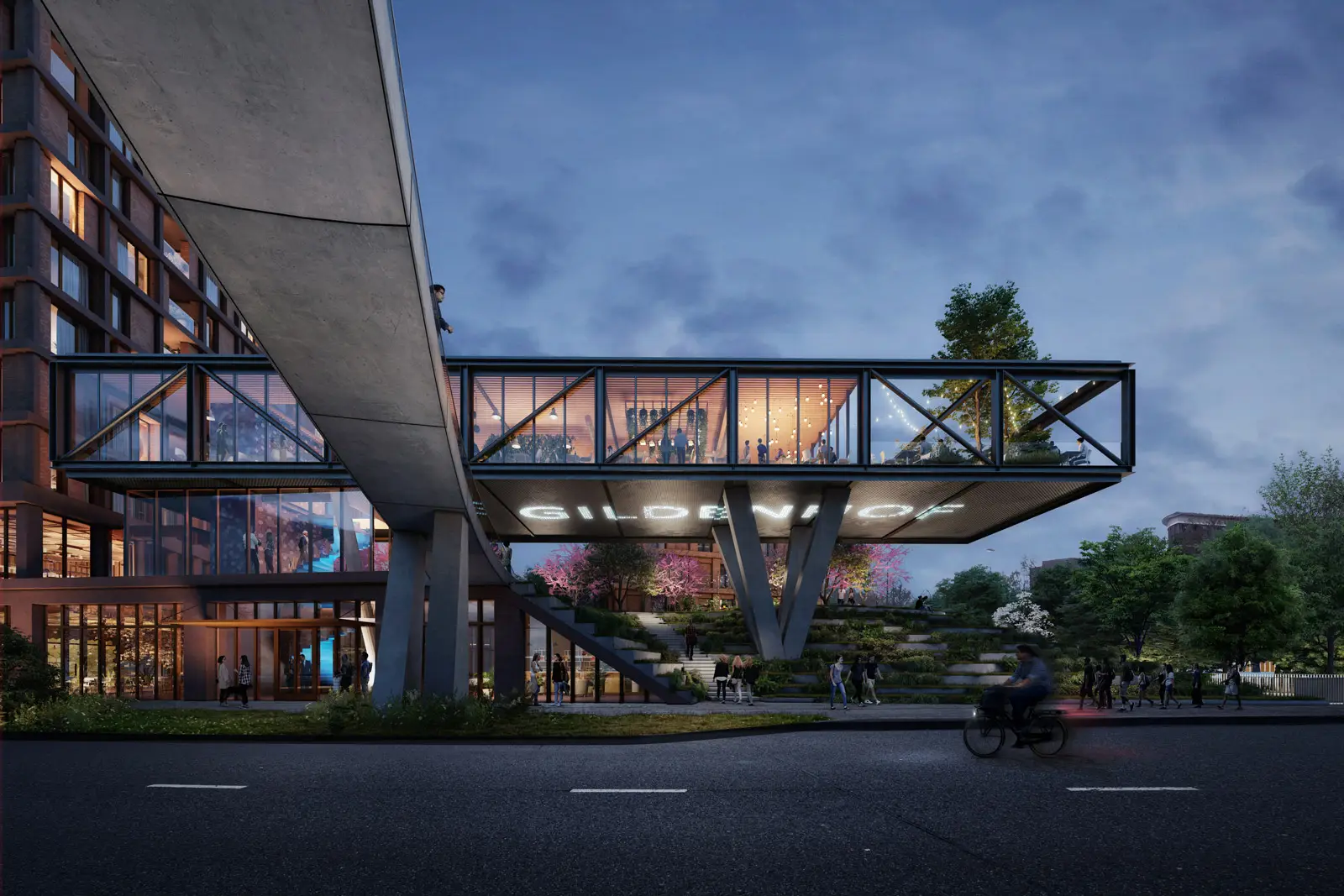
The volume of West House responds to adjacent buildings. The gradual build-up of the block ensures the visibility of the neighbouring buildings from the campus. Additionally, by making a passage at ground level, a physical connection is established. This ensures a direct relationship between the existing building and the new landscape. Furthermore, the shared terraces complement the wide range of places that the park already offers and make people part of the public space within the security of their own home.
We designed and engineered the building completely in 3D and did the complete draft work for the contractor in BIM, together with our advisors, within the given budget and timing.
PROJECT DATA
Client:
Blauwhoed
Investor:
Greystar
Program:
Residential: approx. 90.000 m2
Parking: approx. 12.000 m2
Status:
Completion 2020
In collaboration with:
karres+brands landschapsarchitecten bv
Z-as Maquettebouw
Team:
Rogier Bezuijen, John Bosch, Hesh Fekry,
Jan Hijlkema, Ewout de Jager, Martin de Jong,
Sander Klein, Cees den Ouden,
Javier Oyanarte Callego, Thom Pegman,
Jaime Pérez Galindo, Jorn van Popta,
Wellae el Rowidi, Zachary Ropel-Morski,
Oresti Sarafopoulos, Rogier Söhne,
Gijs Tegelberg, Thijs Ultee,
Maarten Verhelst, Farida de Vries,
Joanna Wnuk, Chris Zwiers,
Artist impressions:
Snow-White Luchtfotografie
Marcel van der Burg
Valentijn Kortekaas

